Mobile-Friendly Footers
I just wanted to put a footer at the bottom of the screen on desktop and mobile, but getting it right was surprisingly kind of a pain in the butt.
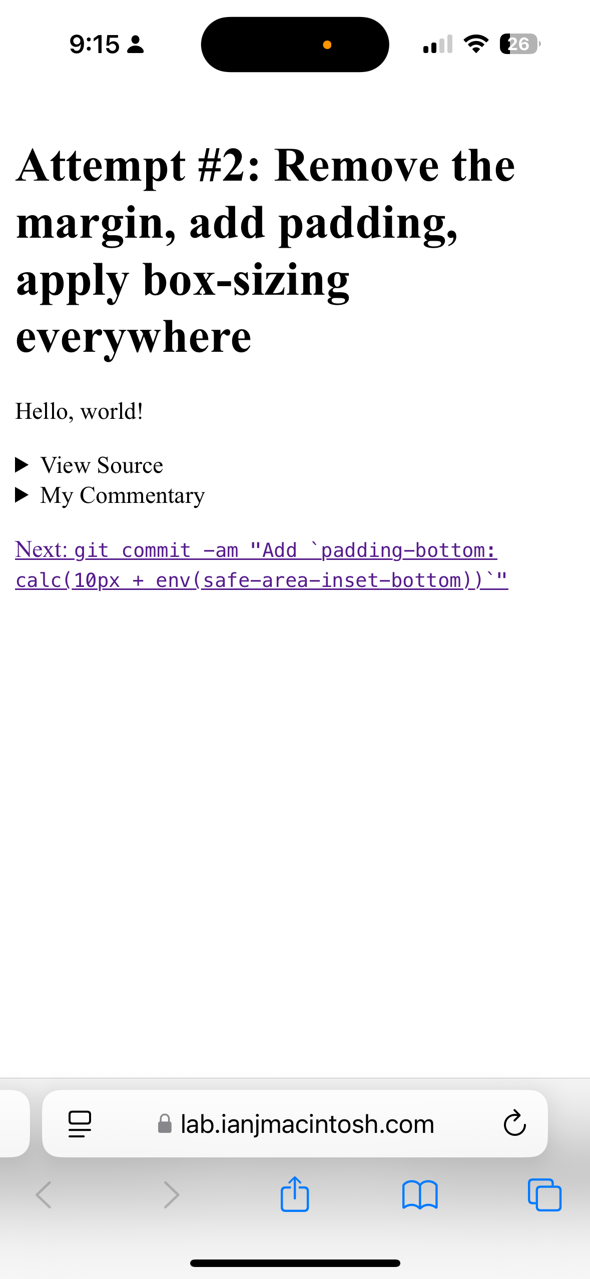
Even though the page content was way shorter than the screen, the footer got pushed "below the fold" on mobile. On Safari for iOS, I could kinda see the footer behind the address bar.

Screenshot of an inexplicably hidden footer on mobile (Safari 18 on iOS 18.1.1; Apple iPhone 14 Pro)
Shippable? You bet. Perfect? Nope.
If you're here just looking for the fix:
body {
  min-height: 100dvh;
}What I was missing was a unit of measure that takes the browser chrome into account: dvh
“In a browser, the chrome is any visible aspect of a browser aside from the webpages themselves (e.g., toolbars, menu bar, tabs). This is not to be confused with the Google Chrome browser”
"Dynamic Viewport-Percentage Units" like dvh are defined by the height of the viewport minus the chrome, so authors can fit content within the exact dimensions of the viewport — whether things like address bars and toolbars are visible or not.
When I searched Google for solutions, I found a couple of other things that aren't quite right:
env(safe-area-inset-bottom)viewport-fit=cover
This article you're reading is the one I wish I'd found before wasting my time with those other solutions.
Attempt #1: CSS grid (rows: 1fr auto) and min-height: vh100
I started out super simple. A document body with two children:
- The container (
<div class="container" />) to wrap my content and constrain its width - The footer (
<footer />) to go coast-to-coast across the bottom of the window
HTML
<body>
  <div class="container">...</div>
  <footer>...</footer>
</body>
And I added a couple of simple CSS rules:
- For the document body:
- Basic black text (
color: #000) on a white background (background: #fff) - Fill up at least the whole viewport height (
min-height: 100vh) - Display the contents in a grid (
display: grid) - Draw the grid's rows so the first child element fills all the remaining space after the browser automatically allocates whatever space the second child element needs (
grid-template-rows: 1fr auto):
- Basic black text (
- For the footer:
- Make it conspicuous; black background (
background: #000), white text (color: #fff), centered (text-align: center)
- Make it conspicuous; black background (
CSS
body {
  background: #fff;
  color: #000;
  display: grid;
  grid-template-rows: 1fr auto;
  min-height: 100vh;
}

footer {
  background: #000;
  color: #fff;
  text-align: center;
}That produced this:

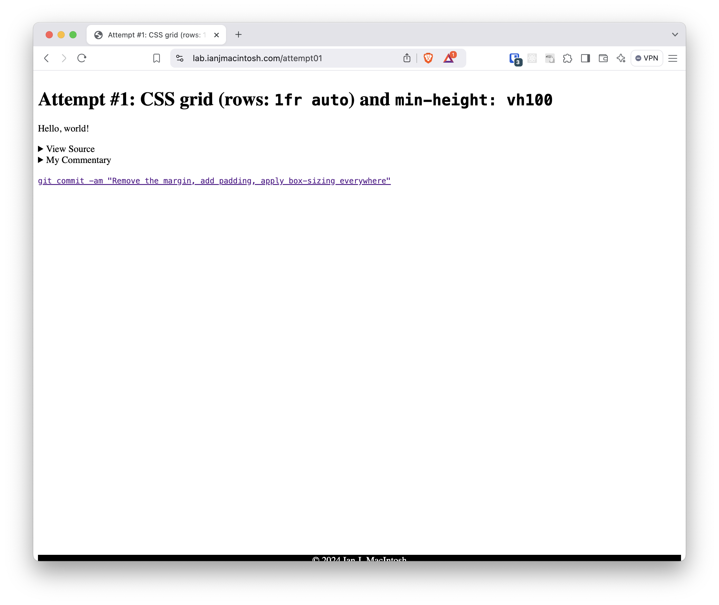
Here's a screenshot of a weird-looking footer (Brave 1.73.91 on macOS Sequoia 15.0; MacBook Air 15-inch, M3, 2024)
I saw I forgot a few things:
- The gap around the footer
- How tight it is inside the footer
No problem, I can fix that.
Attempt #2: Remove the margin, add padding, apply box-sizing everywhere
The solutions here are old as heck in the world of front-end developers:
- First I changed the "box model," or how the browser manages element sizing. At this point, it's a reflex:
* { box-sizing: border-box } - Dump the margin around the page body:
margin: 0 - Give the footer's contents some breathing room:
padding: 10px
CSS
* {
  box-sizing: border-box;
}

body {
  ...
  margin: 0;
}

footer {
 ...
 padding: 10px;
}These results made the page look way better on my computer, but when I checked on my phone, something was pushing the footer down out of view, despite the fact that the page was practically empty.
Here's a video of me scrolling up and down to show and hide the footer on my phone (Brave 1.73.91 on Android 15; Google Pixel 7)
Even worse, I couldn't reproduce the problem on my desktop, so testing a fix would require a real phone or an emulator.
I did some Googling and found a fix that involved introducing some exotic syntax I'd never encountered: env(safe-area-inset-bottom)
Attempt #3: padding-bottom: calc(10px + env(safe-area-inset-bottom))
The env() CSS function allows CSS authors to access "environment variables" set in the browser itself. The syntax in your spreadsheet would look like: env(name-of-variable-goes-here) MDN Docs
One such environment variable is safe-area-inset-bottom
That sounded perfect, so I gave it a shot.
I figured I could just pad the bottom of the footer with that value, plus the normal 10px I wanted anyway:
CSS
footer {
  ...
  padding-bottom: calc(10px + env(safe-area-inset-bottom))
}Which yields...
Here's a video of me scrolling up and down to show and hide the footer on my phone (Brave 1.73.91 on Android 15; Google Pixel 7)
...no change.
You'll probably be tempted to stop reading right about now. If you do, you won't learn why that's the wrong tool for this problem.
The term "safe area" refers to the parts of a display that will be visible on a non-rectangular display, like the 2017 Apple iPhone X one with rounded corners. Those corners of the image are going to get cut off, which could be a problem if there's something important there.
For example: Picture a little tiny "x" (close button) in the top right corner of a full-screen advertisement on an iPhone X. If that button was small enough and close enough to the top right corner of the image, it'd get cut off entirely and you'd never be able to click it.
To let CSS authors know what parts of the screen will be obscured by the screen shape, WebKit for iOS provides those boundaries through its safe-area-inset-* environment variables.
safe-area-inset-bottom is the wrong fix because it refers to display visibility, not page visibility.
But I didn't read the documentation, so I kept on going down the same path, assuming I had a minor syntax issue. After searching Google some more, I found something else related: viewport-fit=cover
Attempt #4: Update the meta viewport tag with viewport-fit=cover
All this safe-area-inset-* stuff is about covering the whole screen, which I'm not sure mobile browsers do by default. Maybe they're allocating space at the bottom of the screen for system navigation buttons or browser controls.
So another recommendation I found was to update the <meta name="viewport" /> tag with viewport-fit=cover to make sure the screen gets covered. The WebKit team even made a 2017 blog post about it.
HTML
<meta
  name="viewport"
  content="width=device-width, initial-scale=1, viewport-fit=cover"
/>And this change yields...
Here's a video of me scrolling up and down to show and hide the footer on my phone (Brave 1.73.91 on Android 15; Google Pixel 7)
...no difference.
After researching more, I'm not sure that syntax above is valid. The CSS Viewport Module Level 1 spec makes no mention of it, and searching for viewport-fit on caniuse yields 0 results.
There's an old pull request for CSS Round Display Level 1 describing safe-area-inset-* that mentions viewport-fit could be set to cover, but doesn't say how that should be set.
The current spec itself says it's set with CSS.
CSS
@viewport {
  viewport-fit: cover;
}
Back to the actual problem at hand: none of this fixes it. My page scrolls when it doesn't need to, and my footer isn't visible on page load.
Then I found another solution: set the page height using dvh units — a unit of measure that considers browser chrome.
Attempt #5: Use min-height: 100dvh
For years, I've set my document's min-height using viewport-percentage units, where 100vh represents 100% of the viewport height.
But what exactly is the viewport height?
Paraphrasing the spec, viewport size could mean 1 of 3 different things:
- Large viewport: The largest potential viewport area, assuming all dynamically expanding and contracting browser UI elements like toolbars and address bars are retracted
- Small viewport: The smallest potential viewport area, assuming all browser UI elements are extended
- Dynamic viewport: Sized with "dynamic consideration" of browser UI elements. This lets authors size their content so it can exactly fit in the viewport, whether or not those interfaces are visible. Ding ding ding ding ding!!
By default, calling vh or vw refers to the large viewport, but my mobile browser initially loads the page in a small viewport. The spec explicitly warns about this when using large viewport-percentage units:
“This allows authors to size content such that it is guaranteed to fill the viewport, noting that such content might be hidden behind such interfaces when they are expanded.”
I want the page to fill the viewport's actual size when I'm looking at it, not its potential full size. This must be computed dynamically, which can be done using dynamic viewport-percentage units: 100dvh:
CSS
footer {
    ...
    min-height: 100dvh;
}And that yields...
Here's a video of me trying to scroll up and down on my phone, but I can't because the content exactly fits the viewport (Brave 1.73.91 on Android 15; Google Pixel 7)
...exactly what I want!
I don't know why I didn't come across this solution first; it's clearly the most logical one, 93.8% of users' browsers support it and has been widely supported since 2022. But I'd never heard of it.
Conclusion
min-height: 100dvh is my new standard for setting a page's height.
I'd like to say that the next time I run into a problem, I'll take a measured approach and read specifications instead of copying and pasting random "fixes" from Google, but I'm not so sure about that. I found dvh by jumping around all mimbledy-bimbledy from search result to search result.
A more realistic takeaway is that if I'm spinning my wheels, whenever I'm ready to calm down, those scary specification documents aren't as stuffy as they look. Like the joke goes, a few hours of trial and error can save you from wasting 20 minutes reading the docs.